
Ideas for better growth
Product Page Optimization: A Practical Checklist
Chris Content · · 5 min read
A working checklist for product pages: images, variants, delivery clarity, proof placement, and the objection handling that turns browsers into buyers.
The product page is where the decision happens. Everything before it is traffic; everything after it is logistics. Yet most product pages are built as a template to be filled rather than as an argument to be made.
This checklist works through the page in the order a cautious first-time buyer reads it.
1. The images have to answer physical questions
A buyer cannot touch the product, so images do that work:
- Scale. Something recognisable for size, or the product in a real setting
- Detail. Close-ups of texture, stitching, finish, ports, joins
- Use. The product being used by a person, not floating on white
- Variation. Every colour and size option actually shown
- Honesty. The flaws visible too. A returned item costs more than a lost sale
Compress properly and reserve the aspect ratio so the page does not jump. See our image optimization guide.
2. Title and price must be unambiguous
- The title should include the attributes people search for: material, size, quantity, compatibility
- The price should be the price. If tax or delivery is added later, say so here
- Show the per-unit price for multipacks
- If a discount is shown, the reference price must be a price you actually charged
3. Variants must update everything
Selecting a variant should change the image, the price, the stock status, and ideally the URL. Common failures:
- The image stays on the default colour
- The price updates but the delivery estimate does not
- Unavailable combinations are selectable and fail at add-to-cart
- The variant is not reflected in the URL, so a shared link loses the selection
Label variants in customer language. "Charcoal" needs a swatch; "Size 3" needs a size guide.
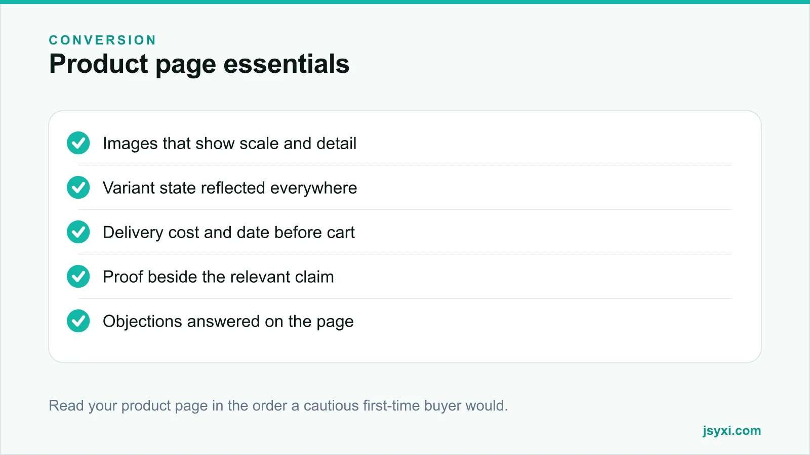
4. Answer delivery before the cart
Delivery uncertainty is one of the largest causes of abandonment, and the cheapest to fix:
- Show the delivery cost, or the threshold for free delivery
- Show an estimated delivery date, not a vague range
- Let the buyer check serviceability by PIN code if coverage varies
- State cash-on-delivery availability if you offer it
- Name the return window and who pays return shipping
Every one of these answered on the product page is a question that never becomes an abandoned cart. See reducing cart abandonment without discounts.
5. Put proof beside the claim
Reviews at the bottom of the page are proof in the wrong place. Distribute it:
- A rating summary near the title
- A quote about fit beside the size guide
- A quote about durability beside the material description
- Customer photos in the gallery, clearly marked as customer photos
Use the Reviews widget and see social proof types and placement for the full mapping.
6. Handle objections on the page
List the reasons someone would not buy, then answer each one where it arises:
- "Will it fit?" - size guide, dimensions, comparison to a known object
- "Is it genuine?" - warranty, brand authorisation, invoice details
- "What if it is wrong?" - return process in two sentences
- "Is it worth the price?" - what is included, cost per use, comparison
- "Will it work with mine?" - compatibility list
A short FAQ accordion with the five real objections outperforms a long description that answers none of them.
7. Make the add-to-cart action obvious and honest
- One primary action, visible without scrolling on a phone
- Stock status stated plainly - "In stock", "Ships in 3 days", "Sold out"
- Quantity control that is easy to use with a thumb
- Clear feedback when the item is added, without hijacking the page
- No surprise upsell modal that blocks the flow
If something is out of stock, offer a notify option rather than a dead button.
8. Give a route to a human
Some questions cannot be answered by a page. A WhatsApp chat button on high-consideration products lets a buyer ask "will this fit my model?" and get an answer while they are still on the page. See the WhatsApp widget playbook.
9. Keep the page fast
Product pages accumulate scripts: reviews, chat, recommendations, analytics, ads. Audit them quarterly and remove anything that does not earn its weight. Our widget performance guide shows how to measure the real cost.
Common mistakes to avoid
- Descriptions written for search engines. Buyers read the description; write it for them.
- Specifications hidden behind a tab nobody opens.
- Delivery information only in the footer policy page.
- Reviews sorted newest-first with no way to filter by rating or topic.
- A sticky bar covering the add-to-cart button on mobile.
Frequently asked questions
How many product images should a page have?
Six to ten for most physical products: one hero, one scale reference, two or three detail shots, one in use, and one per major variant. Beyond that you add weight without adding information.
Should product pages show reviews at the top or bottom?
Both. A compact rating summary near the title, with the full reviews further down. The summary answers "is this generally good"; the detail answers "is this good for someone like me".
Where should delivery information appear?
On the product page, before the add-to-cart action. Cost, estimated date, and return window. Leaving these to checkout is one of the most common causes of abandonment.
Does a longer product description convert better?
Length is not the variable. Coverage is. A description that answers every real objection converts better than a longer one that repeats marketing language.
Next steps
Take your best-selling product page, read it as a first-time buyer, and write down every question you cannot answer from the page. Fix those in order, starting with delivery and returns.
Start free and add the proof and answers your product pages are missing.