
Ideas for better growth
How to Add a Client Logo Showcase
Chris Content · · 4 min read

Client logos build credibility only when they are recognisable and permitted. How to choose them, get permission, and present them without slowing the page.
A row of client logos is the fastest credibility signal on a business website - when the visitor recognises the names. When they do not, it is a row of grey shapes that occupies prime space and slows the page.
This guide covers how to build one that earns its place.
Step 1: Get permission first
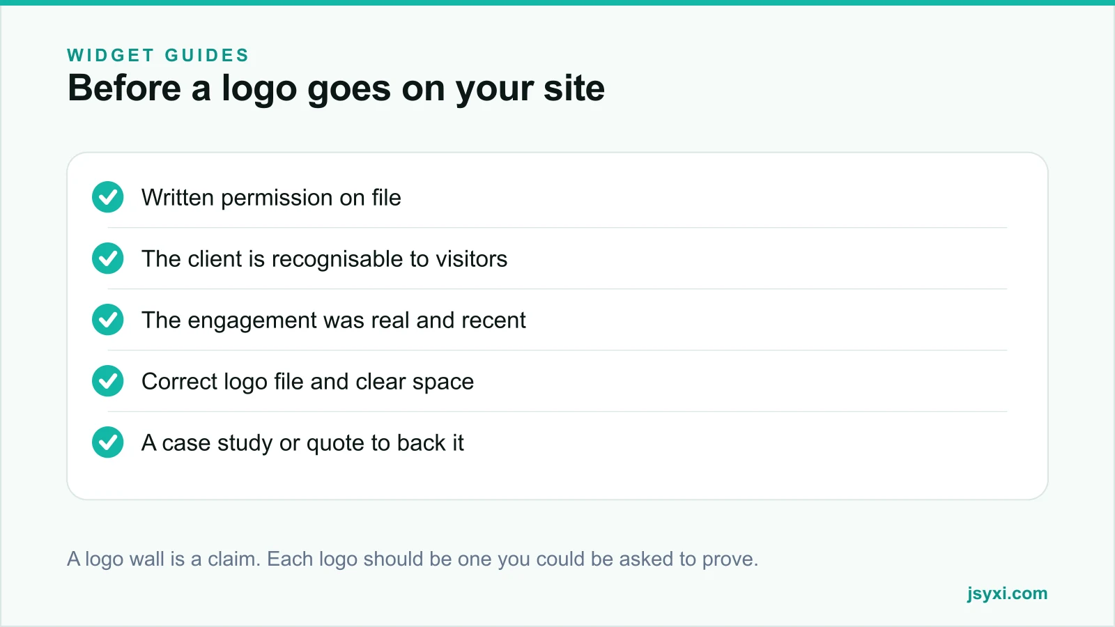
Using a company's logo implies a relationship and, in most jurisdictions, touches trademark rights. Before publishing:
- Ask the client explicitly whether you may name them and use their mark
- Get it in writing, even informally by email
- Check your contract - some agreements prohibit naming the client, and some require approval of the wording
- Ask for their brand guidelines and use the approved logo file
- Honour removal requests promptly
If a client will not permit naming, describe them generically in a case study instead - "a national pharmacy chain" - and leave the logo out.
Step 2: Choose logos your visitors will recognise
Relevance beats prestige. Ask who this page is for:
- On a page selling to restaurants, restaurant clients matter more than a bank
- Local businesses recognise local names
- A single household name outperforms eight unknown ones
- Recency matters - a logo from a project seven years ago is stretching the truth
If most of your clients are small and unknown, a logo wall is the wrong tool. Use named testimonials or a portfolio instead - specifics beat unrecognisable marks.
Step 3: Present them consistently
Logos come in wildly different shapes, and an unedited set looks chaotic:
- Normalise optical size, not bounding-box size - a wide wordmark and a square mark need different scaling to look equal
- Use one treatment throughout: all full colour, or all single colour
- Keep consistent clear space around each mark
- Align on a common baseline or centre
- Use vector files where possible so they stay sharp
Never stretch, recolour without permission, or place a logo on a background that breaks its contrast.
Step 4: Build it without editing your theme
The Logo Showcase widget displays client, partner, or press logos in a grid or a moving strip, and embeds with one line.
Configure:
- Grid when you have six to twelve logos and want them all read
- Moving strip only when you have many and space is tight - and then keep it slow, pause on hover, and never make it the only place a logo appears
- Columns per breakpoint, so phones do not show six tiny marks in a row
- Alt text with the company name, so the logos are readable to screen readers and search engines
Place it with the embed snippet guide.
Step 5: Keep it light
A logo wall is a dozen image requests for content that is mostly decorative:
- Use SVG where you have it - usually a fraction of the size and always sharp
- Compress raster logos properly
- Lazy load the section, since it is almost always below the fold
- Reserve the space so the page does not shift as marks arrive
See our image optimization guide.
Step 6: Back the claim up
A logo says "they worked with us". Visitors want to know what that meant:
- Link each logo to a case study where one exists
- Put a named quote from that client nearby
- State the nature of the work in a caption if it varies - a supplier is not the same as a client
Our post on social proof types and placement covers where this belongs in the journey. Logos answer "is this business real"; they do very little on a product page.
Common mistakes to avoid
- No permission. It is a trademark and relationship risk, and clients do notice.
- Logos from lapsed relationships. Presenting a former client as current is misleading.
- Inconsistent sizing. It makes a considered team look careless.
- Grey undifferentiated marks nobody recognises. They add weight, not credibility.
- A fast auto-scrolling strip. Unreadable, and an accessibility problem.
Frequently asked questions
Do I need permission to use a client's logo on my website?
Yes. Using a company's mark implies endorsement and engages trademark rights. Ask, get it in writing, check your contract for naming restrictions, and use their approved logo file.
How many client logos should I show?
Six to twelve, chosen for recognisability by the audience of that page. One name your visitor knows is worth more than a dozen they do not.
Should logos scroll automatically?
Prefer a static grid. If you use a moving strip, keep it slow, pause on hover and focus, and respect reduced-motion preferences - otherwise it is unreadable and inaccessible.
What if my clients are not well known?
Skip the logo wall. Use named testimonials, a portfolio with real project context, or case studies. Specific evidence beats unrecognisable marks.
Next steps
List your last ten clients, confirm which have given permission, and publish only the ones your visitors would recognise using the Logo Showcase widget - each linked to a case study where you have one.
Start free and make your credibility band earn its space.