
Ideas for better growth
Microcopy That Removes Friction
Chris Content · · 4 min read
The small words around buttons, fields, and errors decide whether people continue. A practical guide to writing labels, hints, and error messages that help.
Microcopy is the small text nobody assigns to a writer: field labels, helper lines, button labels, error messages, empty states, and confirmations. It is written last, usually by whoever is building the page, and it decides more outcomes than the headline above it.
The principle is simple: find the moments where a visitor hesitates, and answer the question in the fewest possible words, right there.
Where microcopy earns its keep
Field labels and hints
- Label above the field, always. Placeholder-only labels vanish the moment typing starts and are an accessibility failure.
- Say what format you want before the error: "10-digit mobile number", "DD/MM/YYYY".
- Explain why you are asking when the reason is not obvious: "For delivery updates only."
- Mark optional fields, rather than marking everything required.
Error messages
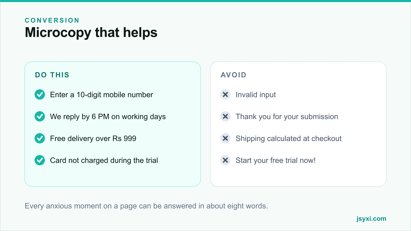
- Say what went wrong and how to fix it: "Enter a 10-digit mobile number" not "Invalid input"
- Put the message beside the field, not at the top of the page
- Never blame the user - "That code has expired" not "You entered an invalid code"
- Never rely on colour alone
- Keep the entered data; never clear the form
Buttons
- Say the outcome: "Get a quote", not "Submit"
- Match the label to the destination exactly
- Use a small line beneath for the caveat: "No card required" - see CTA buttons
Answer the anxious question at the anxious moment
The highest-return microcopy sits next to a commitment:
- Beside the email field: "We send order updates only. No marketing without your consent."
- Beside a phone field: "We call between 10 AM and 6 PM."
- Beside a card field: "You will not be charged until the trial ends."
- Beside add-to-cart: "7-day returns. We pay return shipping on faults."
- Beside a submit button: "We reply by 6 PM on working days."
Each is one line, and each removes a specific reason to stop.
Write success states that inform
"Thank you for your submission" is a dead end. A useful confirmation says:
- What was received
- What happens next
- When, specifically
- Who will do it
- What to do if they need it sooner
"We have your quote request. Rahul will call you before 6 PM today. Need it faster? Message us on WhatsApp."
Write empty states that offer a way forward
Empty states appear at the worst moments - a search with no results, an empty cart, a filter that excludes everything:
- Say plainly what happened
- Explain why, if you can
- Offer the next step: broaden the filter, browse a category, contact support
- Never show a blank area or a spinner that never resolves
A no-results state that suggests three popular categories recovers visitors that a blank page loses.
Set expectations before the action
- Before a long form: "Takes about 2 minutes."
- Before a download: "PDF, 400 KB."
- Before an external link: say where it goes.
- Before a destructive action: say exactly what will be lost, and make the confirm button name the action - "Delete 3 items", not "OK".
Rules that apply everywhere
- Shorter, but not cryptic. Cutting words is good; cutting meaning is not.
- The customer's vocabulary, not your internal terms.
- Active voice, second person.
- Numbers as numerals, so they are scannable.
- No exclamation marks in transactional copy - they read as insincere.
- Never confirmshame. "No thanks, I hate saving money" damages more than it converts, and is increasingly treated as a dark pattern.
Test it the cheap way
- Read every screen aloud; awkwardness is audible
- Watch someone unfamiliar complete the task without help
- Read your support inbox for questions the interface should have answered
- Check every error message by deliberately triggering it - most teams have never seen half of theirs
The errors you have never read are usually the worst copy on the site.
Common mistakes to avoid
- Placeholder text as the only label. It disappears exactly when needed.
- "Invalid input". It tells the user nothing actionable.
- Success messages with no next step. The visitor is left guessing.
- Jargon from your database. "Entity", "record", "submission".
- Never reading your own error states. They are written once and never checked.
Frequently asked questions
What is microcopy?
The small functional text in an interface: field labels, hints, button labels, error messages, empty states, and confirmations. It guides action, unlike marketing copy which persuades.
How do I write better error messages?
Say what went wrong and how to fix it, place the message beside the field, never blame the user, never rely on colour alone, and never clear the data they entered.
Should placeholder text replace field labels?
No. Placeholders disappear as soon as typing begins, are often too low-contrast, and are not reliably announced by screen readers. Always use a visible label above the field.
Where does microcopy matter most?
Immediately before a commitment - the email field, the card field, the submit button, and the add-to-cart action. One line answering the anxious question removes a specific reason to stop.
Next steps
Walk your own checkout and enquiry form, write down every moment you would hesitate as a first-time visitor, and answer each one in a single line beside the element that caused it.
Start free and rewrite your form's helper text and success message today.