
Ideas for better growth
How to Add a Back to Top Button
Chris Content · · 4 min read
A small control that matters on long pages. When it helps, where to place it so it does not cover anything, and the accessibility details usually missed.
A back-to-top button is the least glamorous widget on any site and one of the easiest to justify. On a long article, a category page with a hundred products, or a documentation page, returning to the navigation is otherwise a long swipe.
It is also small enough that people add it without thinking, which is how it ends up covering the checkout button on a phone.
When it is worth adding
A back-to-top control earns its place when:
- Pages regularly run several screens deep
- The primary navigation lives only at the top
- Visitors compare items far down a list and need to re-filter
- Long-form content has no sticky table of contents
- Mobile visitors are your majority, where scrolling costs the most
It is unnecessary on short pages, and on sites with a persistent sticky header that already carries navigation.
Where to place it
Bottom-right is the conventional position on left-to-right sites, and convention is worth following for a utility control.
But bottom-right is crowded. Before placing it, list everything that already lives there:
- Chat launchers, including WhatsApp
- Cookie and consent notices
- Sticky add-to-cart or enquiry bars
- The accessibility toolbar launcher
- The browser's own bottom chrome on mobile
If two of those already occupy the corner, either move one or use bottom-left. Never stack them.
Configure the behaviour
The Back to Top widget provides a floating button that scrolls smoothly to the top. Configure it with restraint:
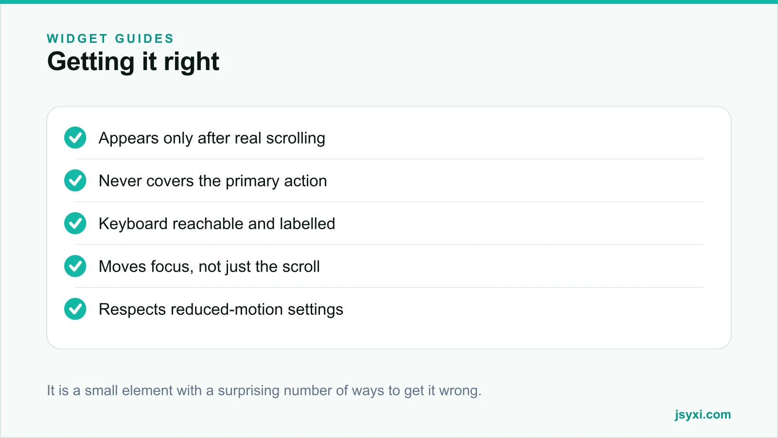
- Appear only after meaningful scrolling - roughly one and a half to two screens, not fifty pixels
- Hide again near the top, so it is not permanently present
- Keep it small. It is a utility, not a call to action
- Use a modest contrast level - visible, but not competing with your primary button
- Include a label or an accessible name, not just an arrow glyph
Place it with the embed snippet guide.
Get the accessibility details right
This is where most implementations fall short:
- It must be reachable by keyboard and show a visible focus ring
- It must have an accessible name such as "Back to top" - an arrow icon alone announces nothing
- It must move focus, not only the scroll position. Otherwise a keyboard user is returned visually to the top while their focus stays at the bottom, and the next Tab jumps them back down
- It must respect reduced-motion preferences by jumping instantly instead of animating
- It must not be a scroll trap or interfere with the browser's own scrolling
The focus point is the one almost always missed. Sending focus to the header or the skip-link target makes the control genuinely useful rather than visually decorative.
Do not let it cost you a sale
On commerce sites, verify on a real phone:
- With the on-screen keyboard open, does it cover the pay or submit button?
- Does it overlap a sticky add-to-cart bar?
- Does it sit on top of a chat launcher?
- Is it still visible over a light product image, and over a dark one?
A tiny utility control that hides a primary action is a measurable revenue problem. Our mobile checkout checklist covers the wider sticky-element audit.
Consider the alternatives
Sometimes the better answer is not a button:
- A sticky header with navigation removes the need entirely
- A table of contents on long articles is more useful than returning to the top
- Pagination or a load-more control on very long listings, rather than infinite scroll plus a return button
- Section jump links on documentation
If your page is so long that visitors need a rescue control, the length itself may be the problem.
Common mistakes to avoid
- Appearing immediately. It clutters the first screen for no reason.
- Icon with no accessible name. It announces nothing to a screen reader.
- Scrolling without moving focus. Keyboard users end up back where they started.
- Covering the checkout button. The most expensive small mistake available.
- Animating for visitors who asked for reduced motion.
Frequently asked questions
Does every website need a back-to-top button?
No. It helps on long pages where navigation lives only at the top. On short pages, or sites with a sticky header, it adds clutter without value.
Where should the back-to-top button go?
Bottom-right by convention, unless a chat launcher, consent notice, or sticky action bar is already there. Never stack floating controls in the same corner.
How do I make a back-to-top button accessible?
Give it a real accessible name, make it keyboard reachable with a visible focus ring, move focus to the top of the page rather than only scrolling, and skip the animation when reduced motion is preferred.
When should the button appear?
After roughly one and a half to two screens of scrolling, and it should hide again as the visitor approaches the top.
Next steps
Check what already occupies the bottom-right corner on your phone, then add the Back to Top widget with a proper accessible name and a scroll threshold of about two screens.
Start free and add it without breaking anything else.