
Ideas for better growth
Exit-Intent Offers That Are Worth Showing
Chris Content · · 5 min read
Exit-intent popups interrupt someone who is already leaving. How to earn that interruption with a relevant offer, honest copy, and rules that respect the visitor.
Exit intent is the most aggressive timing available to a popup: you interrupt someone at the exact moment they have decided to leave. That can be worth doing, but only if the offer answers the reason they were leaving.
Most exit popups do not. They show a newsletter signup to someone who was comparing delivery costs.
What exit intent actually detects
On desktop, exit intent is usually a cursor moving quickly toward the top of the viewport - a reasonable proxy for reaching the address bar or a tab. It is a guess, and it is wrong often enough that you should not treat it as certainty.
On mobile there is no equivalent signal. Cursor tracking does not exist, and the substitutes - fast upward scroll, back-button interception, an inactivity timer - are far less reliable and far more annoying. A back-button trap is a pattern visitors recognise and resent.
The honest position: use exit intent on desktop, and use time or scroll-based rules on mobile, with a much higher bar for interrupting.
Match the offer to the page
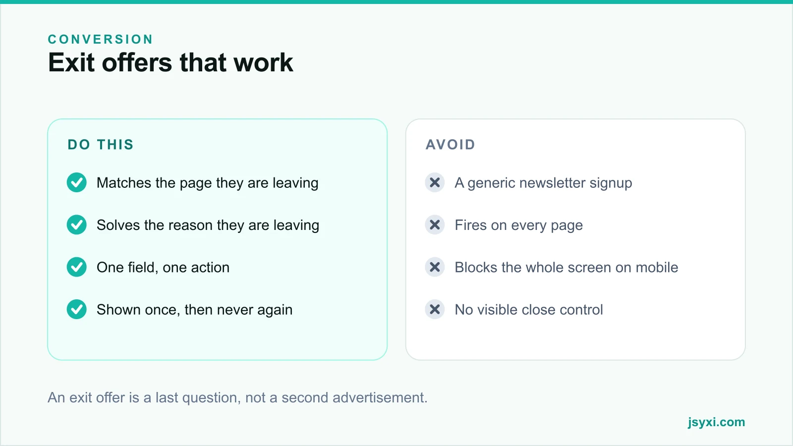
The single biggest improvement is relevance. Ask what the visitor on this specific page was trying to do, and offer the thing that unblocks it:
- Product page - a size guide, a delivery estimate by PIN code, or an answer to the most common objection
- Pricing page - a comparison sheet, or an offer to answer one question on WhatsApp
- Cart - free delivery threshold progress, or a clear return policy line
- Blog post - the next article in the sequence, or a checklist version of what they just read
- Service page - an example project, or a short enquiry form
A generic "10% off, join our list" on all five pages is one offer pretending to be five.
Write it like a question, not an advertisement
Exit copy works when it acknowledges the moment:
- "Before you go - not sure about sizing?" beats "Wait! Special offer!"
- Say what they get, in one line
- Ask for one thing only - an email, a phone number, or a click
- Make the decline option a real, visible control, not a grey line of small text
Never use a confirmshaming decline label such as "No thanks, I hate saving money". It damages brand perception and is increasingly treated as a dark pattern.
Set rules that respect the visitor
Configure the Popup widget with restraint:
- Show once per visitor, and remember the dismissal for at least thirty days
- Never show to someone who already converted or who is mid-checkout
- Never show in the first few seconds of a session
- One popup per session, across all rules
- Suppress on the pages where interruption costs most - cart, checkout, and any form in progress
Also suppress it for returning customers who have already given you their email. Asking again signals you are not paying attention.
Get the mechanics right
- The dialog must be dismissible with a visible close button and the Escape key
- Focus must move into it when it opens and return when it closes
- It must never cover the whole viewport on a phone
- It must not shift the page layout underneath
- It must not load before the page content
Our post on popups that convert without annoying visitors covers the wider timing and frequency rules.
Measure honestly
Exit popups make it easy to fool yourself. A three per cent capture rate looks like free leads; it is only free if it costs nothing elsewhere.
Track together:
- Capture rate on the popup
- Conversion rate of sessions that saw it versus comparable sessions that did not
- Bounce and exit rate on the pages where it fires
- Downstream value of the captured contacts, not just the count
- Unsubscribe rate on the list it feeds
If captured emails never buy, you have added an interruption and a list-cleaning cost with no revenue.
When not to use exit intent at all
- On checkout and cart pages where the visitor is mid-payment
- On any page where a form is partly filled
- On mobile, unless you have a genuinely valuable, page-specific offer
- When your only offer is a discount you cannot afford to give
- When the visitor has already seen the same offer this month
Common mistakes to avoid
- One generic offer everywhere. Relevance is the whole mechanism.
- Firing on mobile with a back-button trap. It is recognised and resented.
- Confirmshaming. It converts marginally better and damages brand meaningfully.
- No frequency cap. The second showing is worse than the first.
- Counting captures without counting cost. Measure conversion, not just leads.
Frequently asked questions
Do exit-intent popups actually work?
They can, on desktop, when the offer matches the page the visitor is leaving. A generic offer shown site-wide usually adds annoyance without adding revenue. Always compare conversion for sessions that saw it against those that did not.
Can exit intent work on mobile?
Not reliably. There is no cursor to track, and the substitutes - scroll speed, back-button interception, inactivity - are guesses that interrupt people who were not leaving. Use time or scroll rules with a much higher relevance bar instead.
How often should the same visitor see an exit popup?
Once, then not again for at least thirty days, and never after they have converted or already given you the same information.
Should an exit offer always be a discount?
No. Information often converts better and costs nothing: a size guide, a delivery estimate, a comparison sheet, or a direct route to ask one question.
Next steps
Pick your three highest-exit pages, write one page-specific offer for each that solves the actual reason people leave, and set a strict frequency cap with the Popup widget. Then compare conversion, not capture rate.
Start free and make your last interruption count.